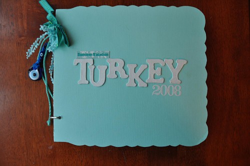
Stories Of Summer : Collection Of Inspiring MiniBooks + Layouts From Readers

INSPIRING SUMMER MINI BOOKS + LAYOUTS
FROM A WONDERFUL COLLECTION OF READERS
Today I want to share a collection of layouts and minibooks that were submitted that inspired me for one reason or another. Read below each example for some comments from me about why I chose to showcase the project.
FROM AUTUMN
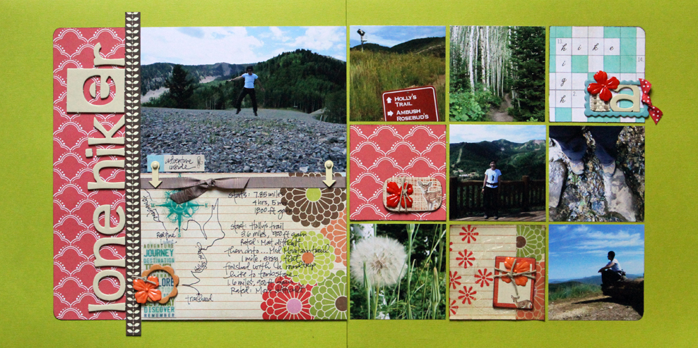
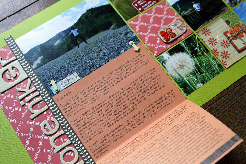
COMMENTS FROM ALI : Autumn is one of those people that leaves an impression. I've had the pleasure of meeting her a few times at different scrapbooking events over the years and every time I see her she makes me happy. She's one of those naturally happy people with a definite joie de vivre. She's also a really great example of someone who scrapbooks without having any kids (at least not yet). Her Week In The Life album is one I send people to who don't have kids and wonder what they are going to capture and document over the seven days. I loved this layout as an example of getting your story told...of not being limited by the space in front of you. Tell your story and make it fit.


Click to view larger.
Click to view larger.
Click to view larger.
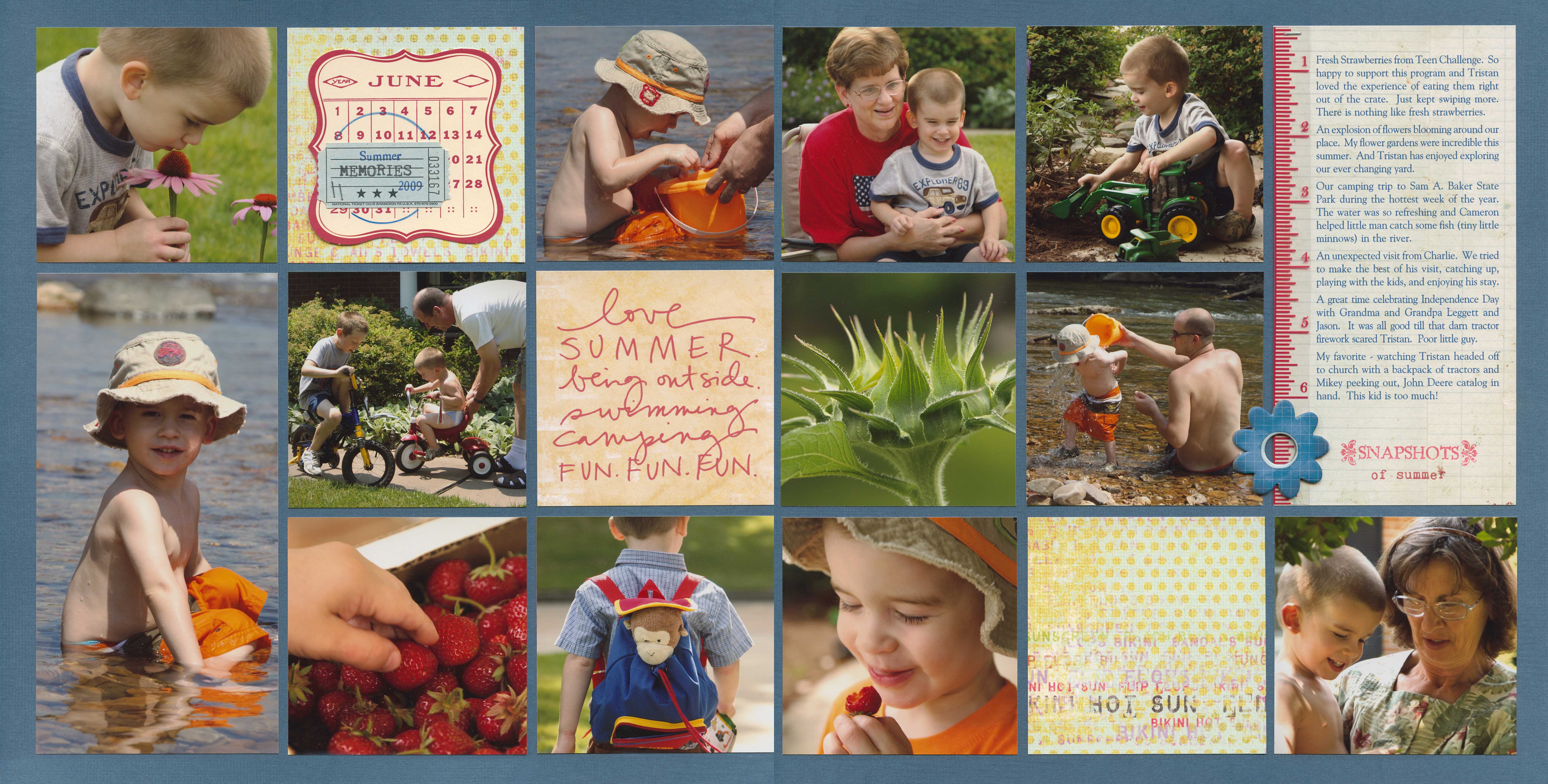
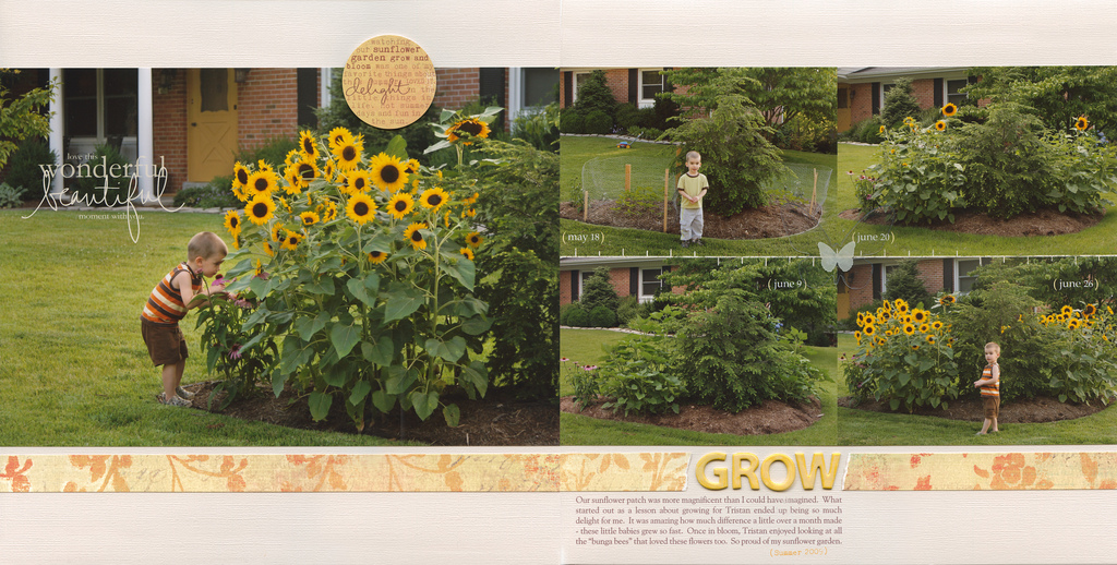
FROM SUSAN
COMMENTS FROM ALI : These layouts from Susan really make me want to scrapbook. I like the way she adds simple details to these two-page spreads. They have a really nice balance of photos, words, and embellished details - with an overall focus on the photos. I'm especially drawn to the first and the last layouts.
FROM ASTA : I live in Lithuania. Here we found out about scrapbooking probably 4 or 5 years ago - the market is just taking it's first steps. I made these travel albums 2 years ago, so I had very few scrapbooking supplies. While making my albums, I cropped big sheets of cardstock and adhered colored paper I bought in stationery shop. I used a lot of memorabilia - tickets, brochures, etc. Some of embellishments I did myself, for example - the tube sign in London album. We did a lot of pictures during these trips, so I wanted to use as many as possible of them.

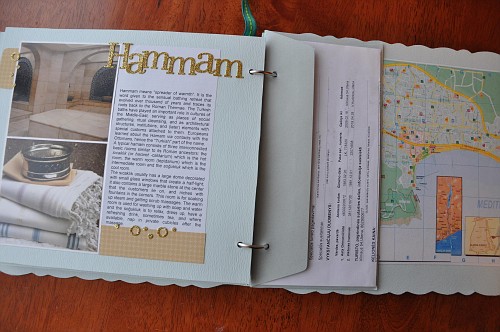


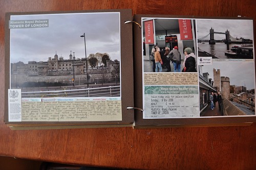
COMMENT FROM ALI : What I loved about both of Asta's minibooks is the emphasis on using pieces from her journey as the decoration (rather than a lot of product). So much color and life comes from ticket stubs and other ephemera gathered along the adventure.
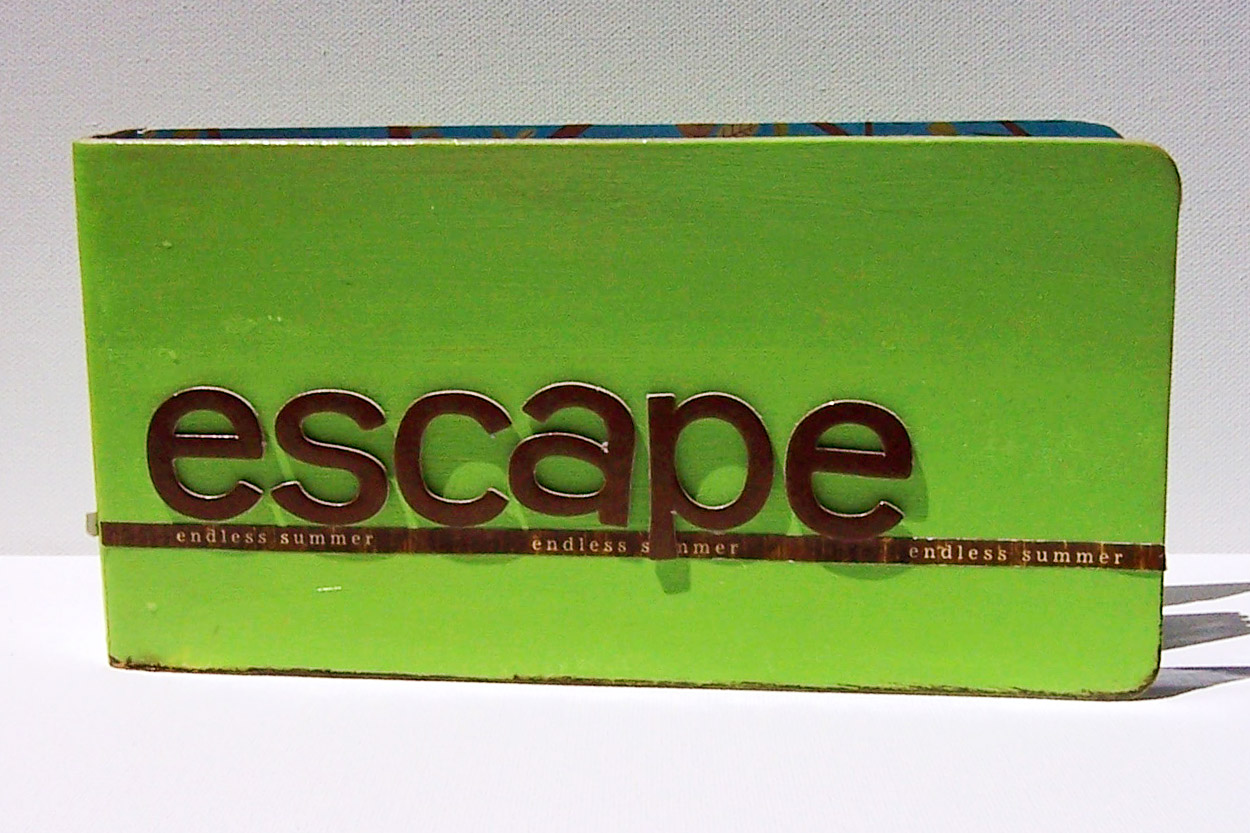
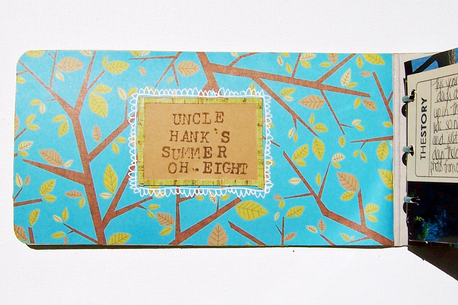
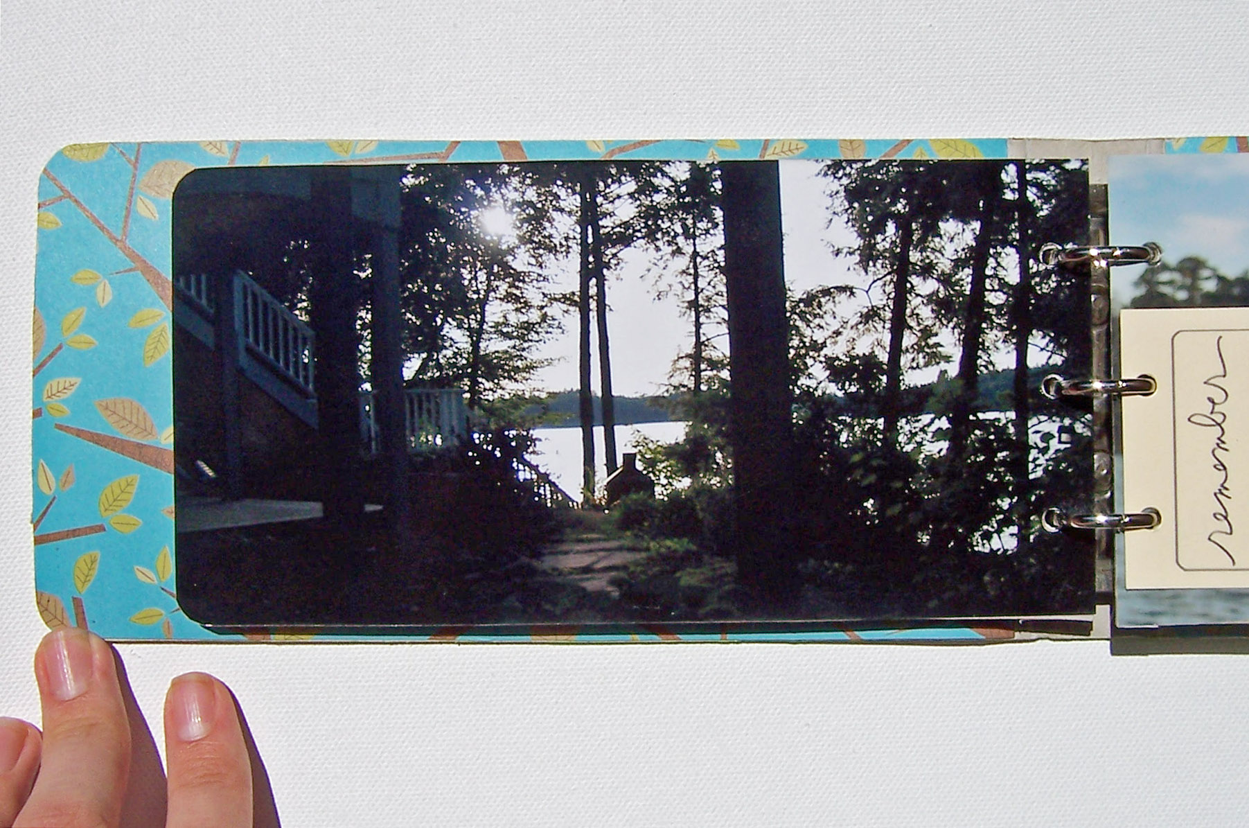
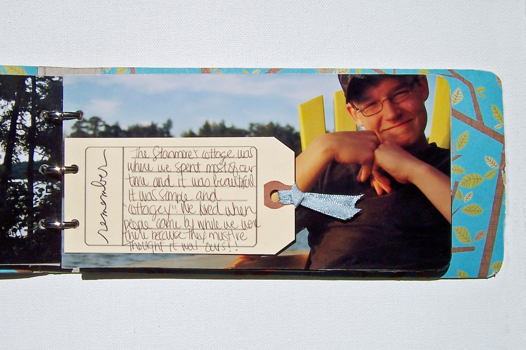
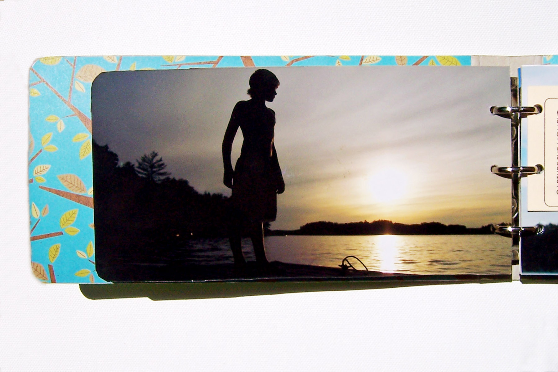
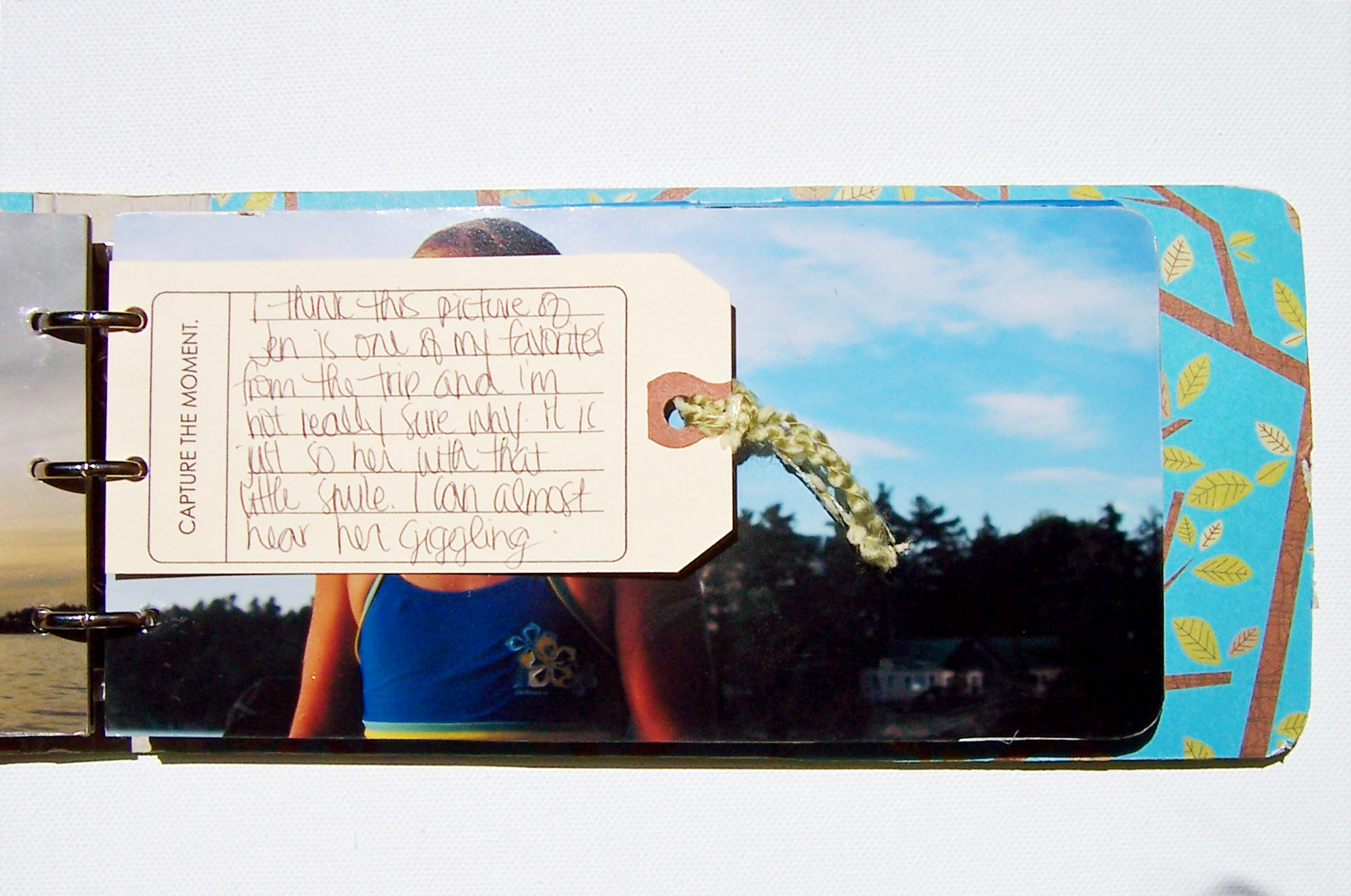
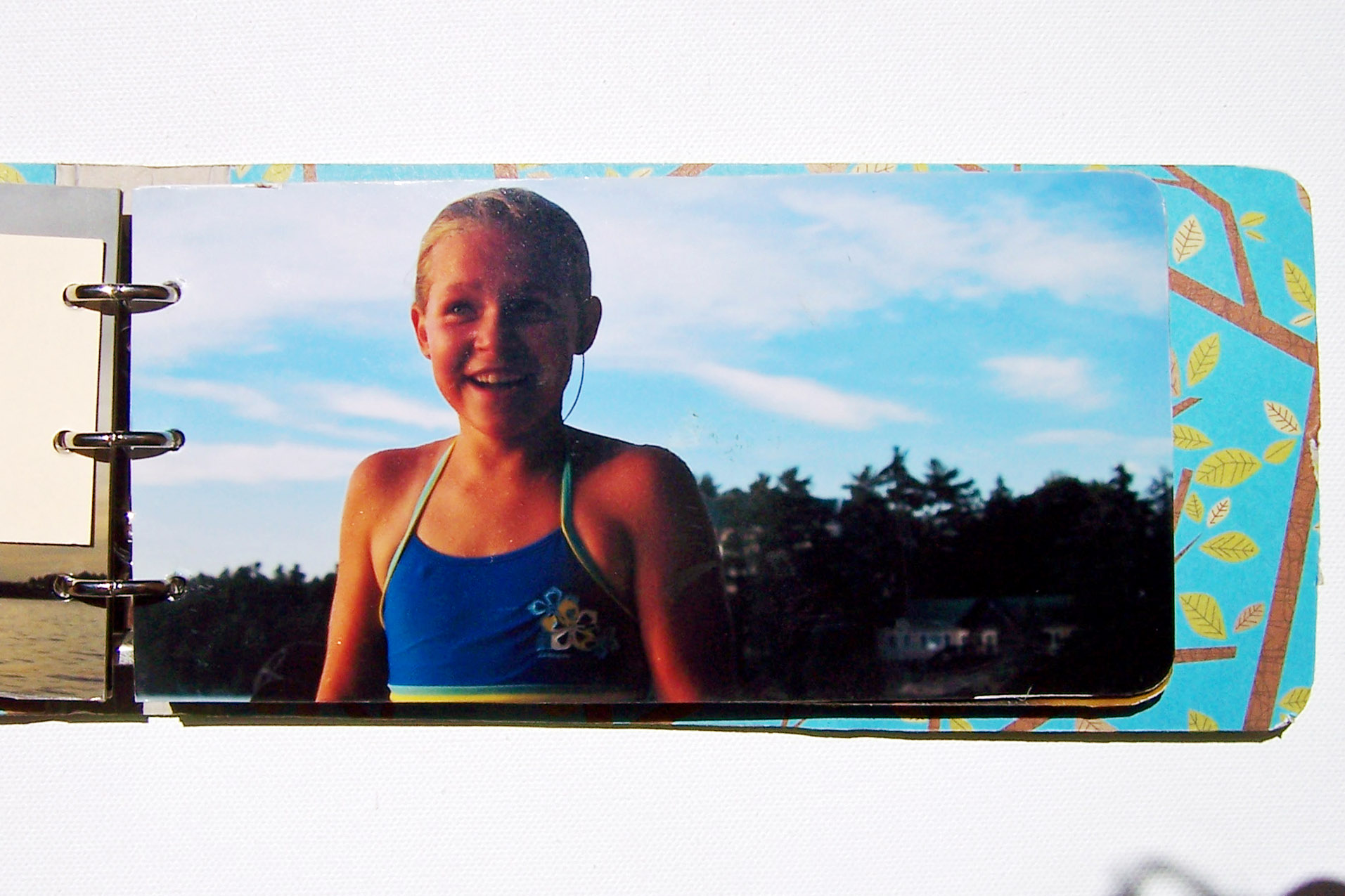
FROM JEREMY : This mini album (Maya Road) documents my family's summer vacation to the cottage in the Muskoka's in the Summer of 2009. With each of our increasingly busy schedules it was the first summer in a few years we had all gotten together for a vacation.
I really wanted to focus on the words + photos of this trips. I had been really inspired by full page photos in magazines and decided to go that route. By allowing each photo to have a full page, the focus was right where I wanted it. I then added journalling tags throughout the album to share the stories from our summer vacation. I kept the embellishments very minimal once again to keep the focus on words + photos.
SUPPLIES: Mini-Album: Maya Road;
Patterned Paper, Chipboard letters: Scenic Route;
Endless Summer Tape: Heidi Swapp; Cardstock: Bazzill;
Letter Stamps: Image Tree;
Ink: Tim Holtz Distress Ink;
White Pen: Uniball Signo;
Overlays: Ali Edwards for Designer Digitals;
Other: Ribbon/Fibers
COMMENT FROM ALI : What I loved about Jeremy's minibook was the full-photo pages with the simple addition of journaling overlays printed directly onto manila tags. It's a great example of how you can use digital supplies for traditional projects. I also thought it was a great reminder of how lovely a simple approach to memory keeping can be with a strong focus on the images and words.
It's not about the latest and greatest. It's about documenting and capturing what's important to you and your family and the life you are living.
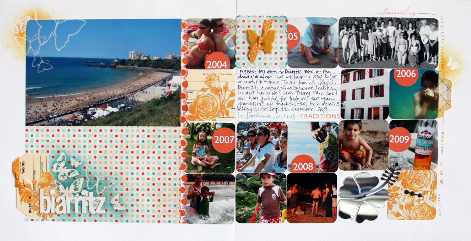
FROM DENISE
Journaling card & tags available as a
free download from Denise here.
COMMENT FROM ALI : One of the things I loved most about this layout from Denise was the comparison of different years vacationing in the same place. Stories that showcase the evolution of time are some of my favorites. I also like the rounded corner squares. I also like the basic design foundation of the smaller squares on both pages - this would make a great repeatable page design for an album.
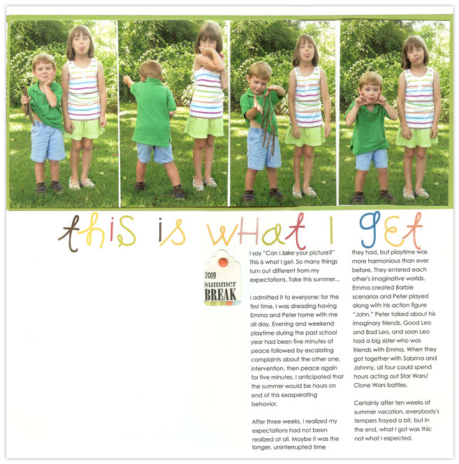
FROM CATHY
picture?” This is what I get. So many things turn out differently than
my expectations. Take this summer for example... I admitted it to
everyone: for the first time, I was dreading having Emma and Peter home
with me all day. Evening and weekend playtime during the past school
year had been five minutes of peace followed by escalating complaints
about the other one, intervention, then peace again for five minutes. I
anticipated that the summer would be hours on end of this exasperating
behavior. After three weeks, I realized my expectations had not been
realized at all. Maybe it was the longer, uninterrupted time they had,
but playtime was much more harmonious than ever before. They entered
each other's imaginative worlds. Emma created Barbie scenarios and Peter
played along with his action figure “John.” Peter talked about his
imaginary friends, Good Leo and Bad Leo, and soon Leo had a big sister
who was friends with Emma. When they got together with Sabrina and
Johnny, all four could spend hours acting out Star Wars/Clone Wars
battles. Certainly after ten weeks of summer vacation, everybody's
tempers frayed a bit, but in the end, what I got was this: not what I
expected.
COMMENT FROM ALI : What I loved about Cathy's layout was the story. I loved her honesty. I love how she began her journaling talking about expectations and finished it with the simple repetition of that same idea. I love how the photos and the words work well together. It's a great slice of their life at a moment in time.

FROM JEAN
COMMENT FROM ALI : I love the enlarged photo as the background for the layout - such a great way to take advantage of digital technology and would look awesome in a hybrid 12x12 scrapbook mixed in with other paper pages. This is on my to-do list.
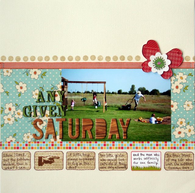
FROM KIMBER-LEIGH : This picture was
the result of taking lots of digital pictures. It seemed insignificant
at first, and it almost got deleted (slightly blurry in the bottom right
corner) but then I realized how perfectly it captured our Saturday
mornings, especially given the blur! I'm so glad I saved it. It's
one of my favorites...and as soon as I realized the slice of life it
captured, the title of the layout immediately came to mind.
COMMENT FROM ALI : I love the photo here. I love the "normal-ness" of it
and how it captures an entire scene rather than a close-up of any one family member. I am continually reminding myself to step back a bit and see more of what is happening rather than always capturing a close-up emotion. Seeing summer in this way has really been a nice gift.


Hi Kristen - I'm happy to explain how I created my layout.
Using Photoshop and one of Cathy Zielske's 12" x 12" templates (from her Design Your Life course offered at Big Picture Scrapbooking this year), I clipped the two photos - one of my son with our dog and the one of the dog - into the photo blocks provided with the template. When I brought in the third photo, the one of my son on the beach, to clip to another photo block in the template, I liked the effect that I saw. A serendipitous effect! So I made that image my background layer. The text block, title, and dotted frame (which was part of Cathy's template as well) are simply "sitting" on the top each in a separate Photoshop layer. The title has a slight shadow applied to it, as do the two photo blocks.
As someone who always colored in between the lines, and doesn't consider themselves to be very creative, I like the safety net that templates provide to get my stories told. ;-) Hope that helps!
Sign in or sign up to comment.
I really liked Asta's album. Can you possibly post more? I love the lay out and how simple but polished it is. I'd love to see more of that style.
Sign in or sign up to comment.