ABC's of Color Inspiration
COLOR INSPIRATION FROM A to Z

[ Teal Bubble Flowers by Alan Buckle via art.com ]
ART : Get inspired by the masters…or people aspiring to be masters. Museums, books about art, galleries, and online art websites are great places to find color inspiration. Make a date with yourself (read Julia Cameron’s Artist Way for more on artist dates), head to a local gallery or book store and get inspired by the use of color in so many different mediums. Take along some colored pencils to sketch appealing color schemes. Art inspiration layouts have also been popular on message boards in the past - do a search on your favorite scrapbooking message board for “art inspiration” and see what comes up.

[ color book is Jim Krause's Color Index ]
BOOKS : Have you really looked at book covers these days? Walking into a book store (or even browsing Amazon) is like a special vacation into color inspiration. Designers have worked long and hard to put together interesting and unique covers – many of which showcase awesome color schemes. Most are very mood-conscious and excel at reflecting to the audience what you will find inside the book. Book stores are also a great place to find more information about color. Check out this cool archive of Book Covers & Designers.
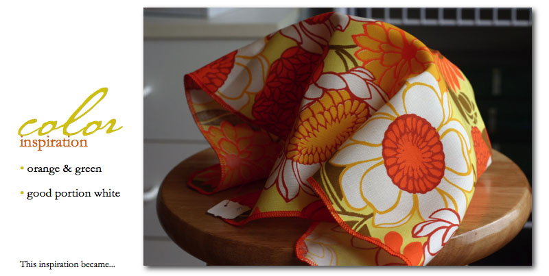
CANDY : Talk about serious color inspiration - I love walking into a candy store and seeing all the candy separated by color. Dump out a bag of skittles into a table and there you go – an instant, bright color scheme. Remember that you don't have to use every color – use it as a jumping off point. Take a trip to a local candy store and prepare to be inspired! Check out candywarehouse.com.

DOWNTOWN : Have you ever taken the time to just stroll around the downtown area of your city? Walking around outside in the fresh air and being open to the possibilities of color inspiration is a great chance to free your mind from color restrictions you may have placed upon yourself. Look to signs, peek in store windows, notice the clothes of people walking by, check out the architecture, or meander through a farmer’s market. Color exists everywhere. Why not take your camera along to record some of your favorites and potentially create a layout based on interesting things you saw on your downtown adventure.
EMBELLISHMENTS : Take a peek into any scrapbook store and you are bound to find a multitude of embellishments in a wide variety of color schemes. Check out epoxy stickers, die cut accents, stickers, and on and on. For your next layout why not take color cues from one of your favorite embellishments and build your page from there. Remember that your colors do not have to match your photos. Look for colors that compliment and support the vision you have developed for your layout.
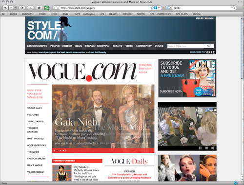
FASHION : Vogue. Elle. In Style. Fashion magazines and websites are excellent resources for color ideas. Trendy colors are shown in combination with the classics for looks that can be easily translated onto your scrapbook layouts. Surf online and simply look at the clothes. Notice how the designers are putting different colors together (texture and pattern too). Pay attention to the tones and hues – and then head to your stash of patterned paper and cardstock and start creating. 
[ image via Sunset.com ]
GARDEN : One of my personal favorite places to find color inspiration is in my garden. Sometimes I will make a special trip to the local garden center to see what new things are blooming – so many cool colors popping up (other times I just check out what my local grocery store has for cut flowers as we speed by on our grocery adventure). Someone once called green Mother Nature’s neutral. How true that is – so many colors look wonderful with green. Remember, an entire color scheme can originate from a single item, even a single flower.

HOME DÉCOR : Furniture. Linens. Wall art. Accessories. Color. Color. Color. Created by designers with a vested interest in making you look (and buy), home déc
or is a great place to locate both fresh and timeless color schemes. In addition to looking at shops and online, don’t forget to check out things around your own home. Things that make you happy. Colors that you chose because they spoke to you in some form or another. So you have a rug that you adore? A blanket that is super cozy? Maybe the color of the blanket would be the perfect match for a layout with a cozy mood.
IDEA BOOKS : Where do you look when you want to see how other scrapbooker’s handle color? One of the best sources are idea books (and magazines). Often I can find color inspiration from one small element that launches me into a whole new direction for a page. Pay attention to those small details. Also, be on the lookout at your favorite bookstore for other interesting general art idea books: including painting, stamping, and other crafts – just another chance to see color used in different ways. For scrapbook idea books check out ideabooks4you.com.
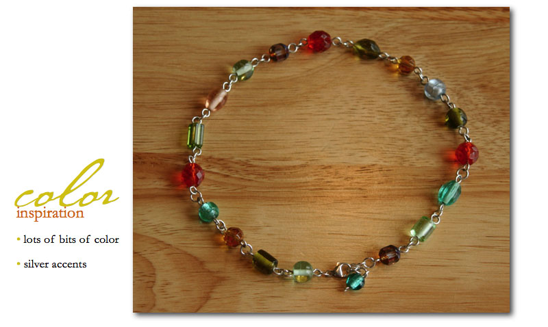
JEWELRY : Jewelry choices are very personal – in many ways just like color choices. It can be difficult to pinpoint why something has meaning to you. Go looking online or at specialty stores (even Target) and you will find a wealth of color combinations at the jewelry counter just waiting to be translated onto your scrapbook pages. It may be one gem that strikes your color fancy or the combination of colors throughout the entire piece. Let your mind and your eyes be open. The colorful necklace above is from Superherodesigns.com.
KITCHEN : Have you ever considered your kitchen to be a source of color ideas? Open up your cabinets. Check out your dishes, coffee mugs, cleaning products, etc. Even those mismatched dishes can push you in the direction of interesting color combinations. Open your refrigerator and take a peek. Food packaging tends to be especially exciting when it comes to color – tons of schemes just waiting for you and you don’t even have to leave your house.
LOGOS : Logos are visual identities for products, companies, organizations, etc. In general, a great deal of thought goes into the creation of a logo that has the potential to be easily recognizable and represent a brand to its truest extent. The designers choice of color (or colors) is huge and is often based on the emotional impact the color will have on the viewer. Begin paying attention to how logo’s make you feel, reflect on the color(s) used, and then match those colors to layouts where your goal is to create a certain mood.
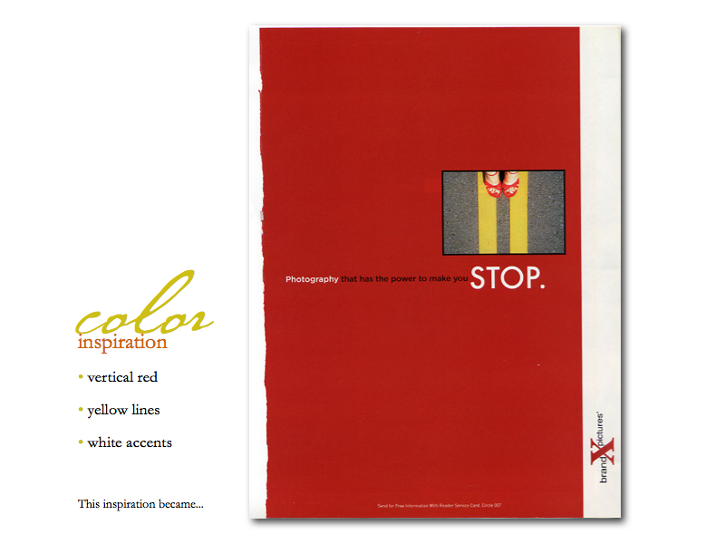
MARKETING MATERIALS : Think packaging and direct mail. Before you throw that junk mail away, take a closer look and see if there are interesting color combinations present…some of the coolest things I have seen recently have come to me in the mail. Billing inserts, credit card solicitations, catalogs – endless ideas. I have also been known to save packaging from drinks, food, gifts, clothing (such as the tags) simply based on their cool color presentation. Creating a file for these little bits of color joy can become a wonderful reference.
NATURE : How often have you seen home, paint, or clothing named after objects in nature? I am guessing often. Put simply, “Nature doesn’t make mistakes with color (www.wpdfd.com).” I love that quote. Color is life. And nature is full of change from season to season. Look for complimentary color contrasts between the sky (blue) and the earth (often orange or beige such as sand), between the green of the trees and the red of the flowers, etc. Interesting brown and green combinations exist as well.
OPPOSITES : Think opposites. Whether it is a color opposite on the color wheel (complementary) or choosing to go with a color that is completely opposite from what tradition dictates (such as red and green for a Christmas layout) – a great way to break out of a color rut is to do something totally opposite from what you would normally do. Try a feminine color or florals on a boys page. Do a pink holiday layout or choose a darker, more muted color scheme for an Easter page. The idea is to get your mind working in another direction. Try a creative experiment on your next layout. Look at your photos. What color would you normally choose? Instead, grab a color that is REALLY different and give it a try. You may love the results.

PAINT STORES : One of the best sources of color inspiration is browsing paint stores or online websites. Their websites offer a plethora of information and visuals dealing with color and color theory. They also usually have sections addressing color trends and the psychology of color. Designers have put colors together to reflect certain moods and conditions. Pick up a few paint swatches and brochures on your next trip to the hardware store. Seeking out these ideas will help you expand your color comfort and knowledge or present a quick color palette. One of my favorites is Behr.com.

[ image from Pottery Barn ]
QUILTS : Quilters seem to have a special talent when it comes to combining colors. They are adept at mixing and matching colors, all the while paying close attention to patterns and texture. Browse a quilting magazine, or other magazine having to do with textiles, on your next bookstore visit or craft store adventure. I am willing to bet that y
ou will find some unique color inspiration just waiting for you.

[ ribbon from American Crafts ]
RIBBON : Colorful ribbon has been popping up everywhere. Easily accessible and fairly inexpensive, ribbon makes a wonderful accent for your layouts and can be a great source of color inspiration. Check out craft stores, specialty ribbon and lace stores, scrapbook stores, and online ribbon outlets for monochromatic or multi-colored examples. I keep some of my newer ribbon all together in a basket on my table – just looking at the color strands makes me happy and has inspired me in creating layouts.
SCRAPBOOK PAPERS : I have a strong affection for patterned papers. They bring life to pages. The colors and patterns can add so much to how I communicate my vision. Manufacturers make it easy for us with paper lines that coordinate stripes, florals, geometrics, etc. It is hard to go wrong when working within a line of papers. That said, I also LOVE to combine patterns from different manufacturers within the same color family (and sometimes opposites) – such as creating a monochromatic page with a variety of patterns. Working with different colored patterned papers is an excellent opportunity to play.
TRAVEL : One of the things that can really open up your mind to new color combinations and inspiration is travel. This does not have to be exotic travel to far away destinations; it can be traveling to the next town over. The idea is that you immerse yourself in something that you do not experience daily. It can even be as simple as taking a different route from work. New visual stimulation can be key in expanding your use of color. Plan a little mini-travel day and focus on the colors you encounter. Once again, don’t forget your notepad, pen, and camera.

UNIQUELY YOU : Part of the absolute beauty of color is that it is so very personal and subjective. We all have our favorites. We all have ways that certain colors make us feel – with the power to evoke so much emotion. Part of excelling at using color is gaining confidence in your own color choices – in the colors that first come to mind when you are thinking about a new page. You have permission to go with your instinct and create pages filled with colors you love. The colors that communicate the visions for your pages. Choose colors without fear that you are making a mistake because there really are no mistakes when it comes to your own preferences and inspirations for color.
VISION : Establishing a vision (the story you want to tell) for your layout can help you choose colors that assist in communicating the mood of your page. Colors have general associations (in addition to our personal attitudes and feelings) that have been shown to exist culturally and/or universally. Some psychologically based, some environmentally based. For example, red is often associated with passion or as a symbol to stop. Knowing these color associations as you go about finding inspiration can help you in matching colors with particular moods and emotions in your layouts.
WORLD WIDE WEB : The web is not only a great source for color inspiration, but also color education. There are a variety of sites that go into many more details about what color is scientifically, color theory, etc. Take a break from scrapbooking some rainy winter afternoon and dedicate some time to reading more about color and how it can add so much to the ways in which your layouts speak to your viewer.
XEROX : To me, Xerox is representative of classic black and white. Timeless. Often dramatic. Contemporary. Clean and crisp. The use of black and white together at their full hues (100% of each) creates a strong contrast. The dark black will recede while the white will come forward within the design. For a softer look, try moving more towards a cream and a bit of lighter black. When you get stuck in a color rut, consider doing a page employing only black and white elements. Patterned papers, embellishments, cardstock, etc. Pay attention to the mood you create with this design. What happens if you add one spot of color? How does this change the mood and dynamic of the page? There's even a whole genre of art out there called xerox art.

YOUR PHOTOS : One of the first places to look for color inspiration is within your photos. It is a simple place to begin. I tend to ask myself, “is there a color I can pull out of this photo that will complement and work well with my vision for this layout?” I enjoy working with the limitation of beginning with one color. From there I start the process of building my page. Choosing patterned papers, embellishments, and accents that contribute to my vision – keeping with a color scheme that came directly from my photos.
ZOO : Yes, the zoo. And while color inspiration can certainly come from the cool variety of animals at the zoo, often tim
es I am most inspired by the signage at the zoo. The colors chosen for directional and educational signage tend to be full of life and fun and reflective of the educational nature of the zoo. Even their websites are cool color inspiration locations and easily translated into color schemes for layouts.

This content is adapted from my ABC's of Color class that was originally created for Creating Keepsakes Events in 2004.


This is wonderful, Ali! I'll be referring back to it for inspiration. So many great ideas!
Sign in or sign up to comment.
Thank-you so much for sharing this with us, it is so inspirational. I want to go home and acrap right now, but instead, I will look for color inspiration all around me.
Sign in or sign up to comment.
Ali ... you are a machine :)
THis is so inspiring, thanks for sharing.
Fabulous!
Bek xo
Sign in or sign up to comment.
OMG, I love, love the "Time" layout (all the others too), that picture of Simon is so sweet, he is absolutely adorable!!!!!!!!!!!!
Sign in or sign up to comment.
HI Ali. This was one awesome post. THANK YOU!!!!!! And I am a huge fan of the book artists way too. A must have read for any artist. I have been doing artist dates and morning pages for 12 years now. And I can't imagine creative life without them. Thanks for sharing so others will read it:) YOU rule:)
Sign in or sign up to comment.
This post is exactly what I needed to get inspired and back into "it" again. I mean ART. It used to be my every day besides my child and my family. Thanks for getting me back on track! You are awesome!
Sign in or sign up to comment.
As always, you're full of wonderful ideas.
Sign in or sign up to comment.
WOW! What a post! I hope you don't mind, but I'm printing this off, putting each letter on an index card, and using them to randomly pull out ideas when I'm in a rut. With my little boy, I'm eternally in greens, blues and browns. Not that that's a bad thing (my fav colors!), but it's fun to jump out and give Oliver a page that pops out from the rest of his section in our albums.
BTW-thanks for the post on cloth diapering. We're currently "trying" for #2, and I'm pretty sure I wanted to go this route. It's nice to have a jump off point for research!
Sign in or sign up to comment.
Hi Ali: Thanks so much for such a re-inspiration. It's all stuff you know, but you put it in such a concise, go-to listing. And I LOVED how you translated the inspiration and the results. Ah... got my mojo goin' again!
Sign in or sign up to comment.
Amazing post!!
I've stumbled it ;)
Sign in or sign up to comment.
wow an inspiration & a joy to read thanks seeya hugya *G*
Sign in or sign up to comment.
great post.
that orange A layout is a favorite.
I remember seeing it a few years ago and falling in love.
Sign in or sign up to comment.
Thank you for all your hard work!
Sign in or sign up to comment.
You are such a great teacher!!! Keep it coming. Thanks.
Sign in or sign up to comment.
Utterly amazing post! Thanks for all the effort you put into it. And I have one more to add to the list. Color inspiration from your blog!
Sign in or sign up to comment.
So great, many thanks for all
Sign in or sign up to comment.
Tremendous post, thanks for putting so much time and energy in this, i appreciate it! Hugs for your family, Hedwig
Sign in or sign up to comment.
FANTASTIC article!
Sign in or sign up to comment.
I liked this: "What color would you normally choose? Instead, grab a color that is REALLY different and give it a try. You may love the results."
Thanks and great article!
Gavin
Sign in or sign up to comment.
Ali...thanks for all of the wonderful ideas. I loved the archive of book covers (very cool)! I find that I get a lot of my inspiration from browsing the aisles at Target. Whether it's the design on the paper plates, the neat pattern on a coffee mug, or the colors on a shower curtain...there's a treasure trove of inspiration to be found!
Sign in or sign up to comment.
Thank you, Thank you, Thank you,
I was enrolled in your ABC class for CK Seattle last year. I had to have major unplanned surgery and missed the whole weekend. I did pick up my kits but they were very hard to follow. I feel like I got a chance to take your class now!!!
Sign in or sign up to comment.
Amazing "post" Ali...missed you at inspired this year...obviously having a new baby is giving you all the creative inspiration that you need...thanks so much...I'm gonna have to make this into a mini "abc" tag album to hang on my inspiration board. Have a great week. Fondly, Roberta
Sign in or sign up to comment.
so great.Thank you for all your hard work!
Sign in or sign up to comment.
amazing, this is such a great website!!!!!
Sign in or sign up to comment.
Bullard to say anything that will surprise investors,
since reclaim ppi Fed officials have been stepping up enforcement efforts in recent
months.
My blog: ppi claims
Sign in or sign up to comment.